
Making Products 12% Easier to Find for Online DIY Shoppers with Strategic Design
The Home Depot
Role: Project Lead, Lead Researcher, Lead Designer & Visual Designer
Team: Sr. UX Designer, Sr. UX Content Strategist, UX Manager, Sr. Product Manager, Principal Product Manager, Sr. Principal Engineer
Timeline: 8+ months
My goal was to make it easier for people to find the right products and reduce the feeling of being overwhelmed while shopping online, especially for those new to DIY projects. I started with the assumption that cluttered pages and too much unnecessary information make it harder for people to find what they need and make decisions.
Simplifying Product Information
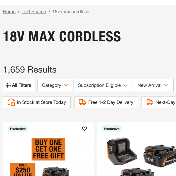
Customers told us they felt overwhelmed by the number of products and the way information was displayed. To better understand what they needed, we studied how they shop online and asked them about their experiences.
Key Question:
"How much effort was it to find what you were looking for?"
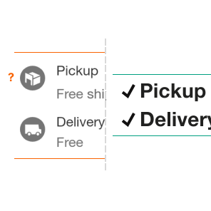
Reducing Visual Clutter
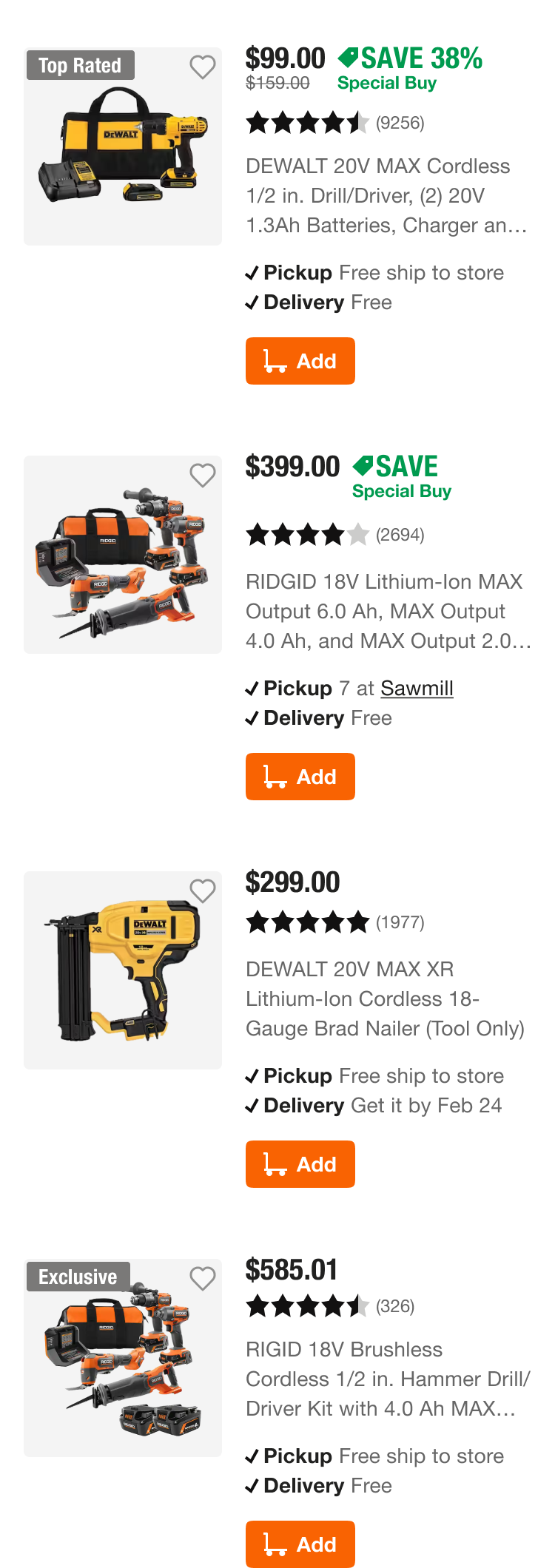
We found that people felt the pages were too busy, making it harder to focus. This was caused by inconsistent formatting and too many unnecessary details. By simplifying the design and making it more visually appealing, we helped people focus on the products.
Key Insight:
"Rate your agreement with the following: ‘I find the page visually appealing’."
Impact
These changes convinced company leadership to invest in a team dedicated to improving how product information is presented online. Early testing showed a 12% improvement in how easily people could find products in key categories.
How We Measured This
We tracked things like how often people used the search feature, how long they stayed on a page, and how quickly they interacted with the page. The time it took for people to click on something dropped from 4.2 seconds to 3.1 seconds, suggesting they found what they needed faster.

Building Alignment Across Teams
This project not only improved the shopping experience but also helped different teams in the company work together better. We agreed on how to measure product find-ability and created guidelines to ensure future designs stay focused on what shoppers need.
Key Moments:
We developed a system to prioritize important content and remove unnecessary details whenever product information is shown.
Regular check-ins with other teams that help build and maintain our site helped us stay aligned and make better decisions together.
Next, we’ll apply these improvements to more product categories and fine-tune how we measure their impact. By continuing to gather feedback from shoppers and working closely with other teams, we’ll stay focused on what customers need and what works best for the business.
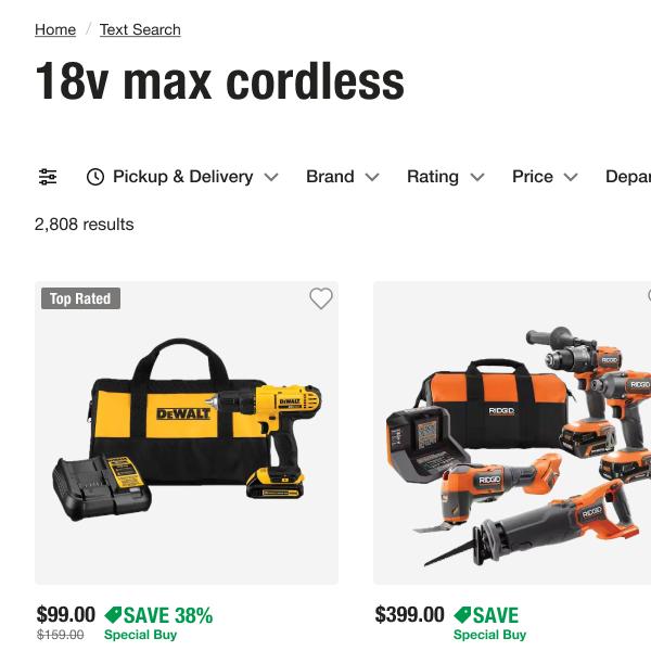
Before: “Easy” (11/16)
People could find the information, but some said they had to scroll a lot or that the information didn’t all fit on one screen.